5 Things Your Website is Missing
It’s easy to get caught up in all the details, information and planning that goes into a website. What starts out as new and exciting may even turn into “let’s just get it done, ugh”. There is a site map to define, usability to plan around, content to share, code to write and a whole host of pages to account for. But in the midst of all the elements that make up a website, it’s important to not lose focus on some of the most important things that can get overlooked.
Scan over these five things and see if your website is missing any:
1. An Immediate Statement of What You Do
Seems obvious, yet how often is it missed? Website visitors are bouncing from site to site and want to know if your site is a match for what they are looking for. Even large companies that we would assume most people know what they do, will make this immediate statement upon entering their site.
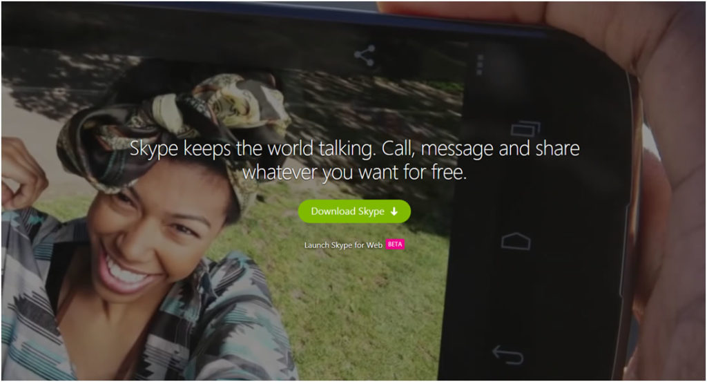
Our own website instantly says what we do. We help you succeed online. As you scroll further down the home page, our website design further elaborates on that theme.

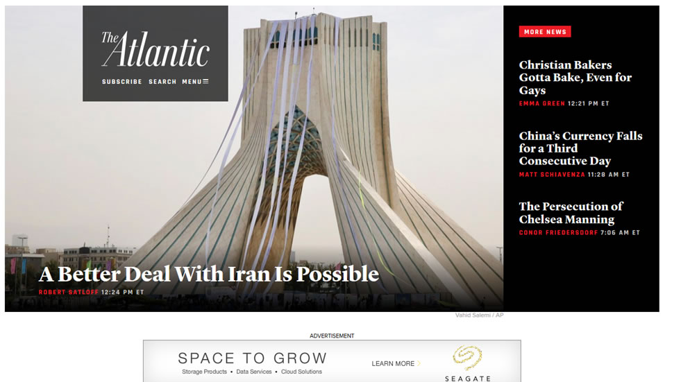
Take a look at the example below. Upon entering their home page, I can’t really tell what they do. They are asking me to subscribe, but I don’t know what I’m subscribing to or what they offer. A missing statement that defines what the product, service or purpose of the site is about, is a sure fire way to increase bounce rates and lose visitors… even if you have something really great to communicate.
2. Headlines that Capture
Just like a newspaper (gasp, I compared a website to a newspaper), the right headlines are vital. They make the difference between engaging the visitor or letting them go. It’s the element on the page that passes the “quick scan” test as users quickly scan what’s before them to see if something piques their interest. A clever headline will catch their eye and draw them into the text below it. It seems some of the best headlines are on news related sites. Speaking of headlines that scream for attention, how about those tabloids at the checkout counter. Of course your captivating headlines should be about the information you want to share, but I think you get the idea. Make them interesting!
I’d like to think the headline of this blog post, was somewhat catchy. Maybe that’s why you are reading this. I could’ve chosen something like “Some things to know about websites”… but then you might’ve never clicked through to read this.
3. Transparency
No, not life transparent .gif’s… please no. More like, let them see who you really are. One thing I usually recommend to our clients is having an “About Us” page. Some companies don’t like talking about themselves or sharing too much information on a more personable level, but I love to see it. I believe being real, honest and open helps prospects gain a comfort level of who they are considering doing business with. Some “About Us” pages are so non-revealing that it doesn’t really tell anything about the company. Don’t be afraid to open up a bit and let them see the real you. If you don’t want them to see the real you, maybe there are deeper issues to work through.
4. A Clear Call To Action
You can communicate all the great content you want, but please make sure to give them a call-to-action (CTA) after you communicate it to them. They sift through your material, get to the bottom of the page, now what? What do you want them to do? Leave? I doubt it. You work hard and possibly pay decent money to get traffic to your site, so make sure you convert when they are there. If you are showing products, put the add-to-cart buttons beside the product or a button for them to easily leave their details showing their interest in that product. Otherwise they might go on to the next website where they will find more product information and possibly engage with that website instead.
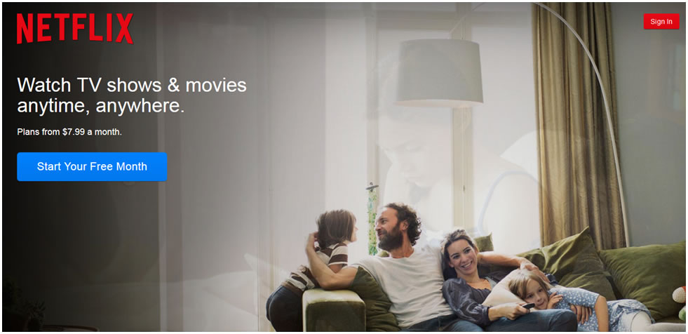
In the Netflix example, they are doing two things right (among many others). Notice the immediate statement of what they offer. Also, notice the call to action. It is very clear they want people to start their free month with the notable blue button. What would the site be like if they didn’t have the CTA? Obviously wouldn’t convert well. Do you have clearly defined CTA’s?
5. Enough Content
Content is king or queen depending on who you listen to. Either way, content is good. Good for search engines, good for inquiring minds, good for user experience. Visitors are on your site, because they are seeking out information about your company, products and/or services. Don’t disappoint them. Make your site resourceful and give them what they are looking for. You don’t have to write a book, but give them enough to show you are the experts and to whet their appetite for more. Build that credibility so your website visitors understand you know what you’re talking about.
Summary
In summary, be sure to:
- Have that immediate statement of what you do to qualify yourselves
- Sprinkle in those engaging headlines
- Let them see the real you
- Don’t forget to ask for the sale, give them the opportunity to convert
- Make sure your site is resourceful with adequate content and information
It wouldn’t be right to close this post without a call to action:
Need help implementing any of these strategies?
Contact us Today!!


