Responsive Web Design
- What is Responsive Web Design?
- Is my current website mobile friendly?
- Is Responsive mobile friendly?
- Is Responsive and mobile friendly the same?
What Is Responsive Web Design?
When it comes to maintaining your website, it is important that it is accessible on all different devices. Nowadays, it is less likely that people are sitting on a desktop computer while surfing the web and more likely that they are on their phone, iPad, etc. No matter what device is being used for online research, it is essential that your website can be easily accessed by consumers. This can be accomplished through responsive web design.
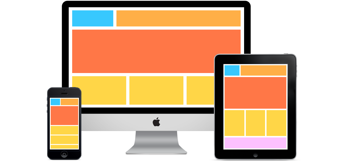
Responsive Web Design is a newer way that most professional web design companies are building. This is a method where the website is built in a way to respond differently to different size devices. With the increased popularity of mobile devices (laptops, tablets, hybrids, smartphones, etc) showcasing a multitude of screen sizes, the concept seems to fit.
The Ins and Outs of Responsive Design
To incorporate responsive design in a website, the developer will create a set of rules called media queries that tell the website to behave or respond differently based on the screen size of the viewing device. What this means is that if you access a website on a small tablet screen like an Apple iPad instead of a traditional desktop widescreen monitor, you may see the same website displayed differently. If you view that same website on a smartphone, you will probably see it displayed differently once again to be more accommodating to people viewing it on their phone. This could mean some graphics are eliminated, the content simplified, or the navigation bar condensed into a single drop-down icon.
The better your responsive design is, the more likely consumers will remain on your website for a longer amount of time, thus decreasing your website’s bounce rate. Visitors on your website will not have to zoom in to see different photos, tabs, etc. in order to navigate through your site. No matter what device is used to view your website, responsive design be beneficial for your company.
Unsure if your website meets consumer standards? Check out our FREE website audits!
Get More Traffic with A Responsive Website
Another option for a responsive website is to build a completely different mobile website. Instead of one master website with a bunch of media queries and rules, there are two separate websites: one for smartphones and one for traditional desktops. The mobile version just displays the core basics of what mobile users may be interested in seeing, and not much else. You can also include a link to the full website, if mobile users would rather see that.
WebTek can analyze your website analytics to determine devices being used and percentages of overall traffic to better consult and recommend how to approach your mobile strategy and determine if responsive web design is right for you.
Your pathway to success begins now. For more information on our responsive websites, contact us today and let’s get started! We are excited to now be offering our web design services in Sarasota, FL. Our website design experts are eager to assist you on your new and improved website.